Blue Line Capital
Modern Branding Refresh & Animated Website for Leading Chicago-based Investment Firm
Brief
US-based professional investment advisor, Blue Line Capital, a wanted to modernise and update their web presence with a new website and refreshed branding.
Working closely with Bill Baruch, president and founder, we set out to overhaul the brand's online and off-line image. As well as a full new brand book and CI, we needed to create a new investor deck, and design and build a website that would showcase the new look and shine a light on Blue Line Capital's legacy, professionalism and wealth management acumen.
OUR SOLUTION
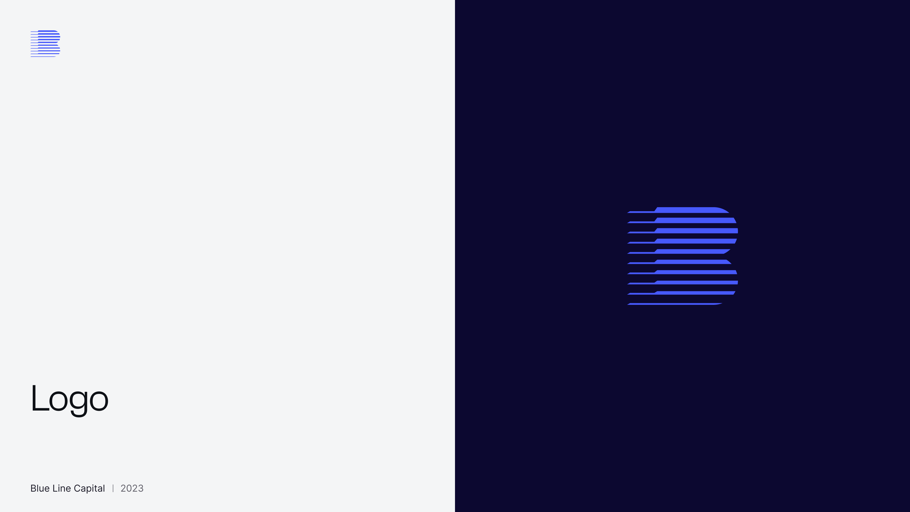
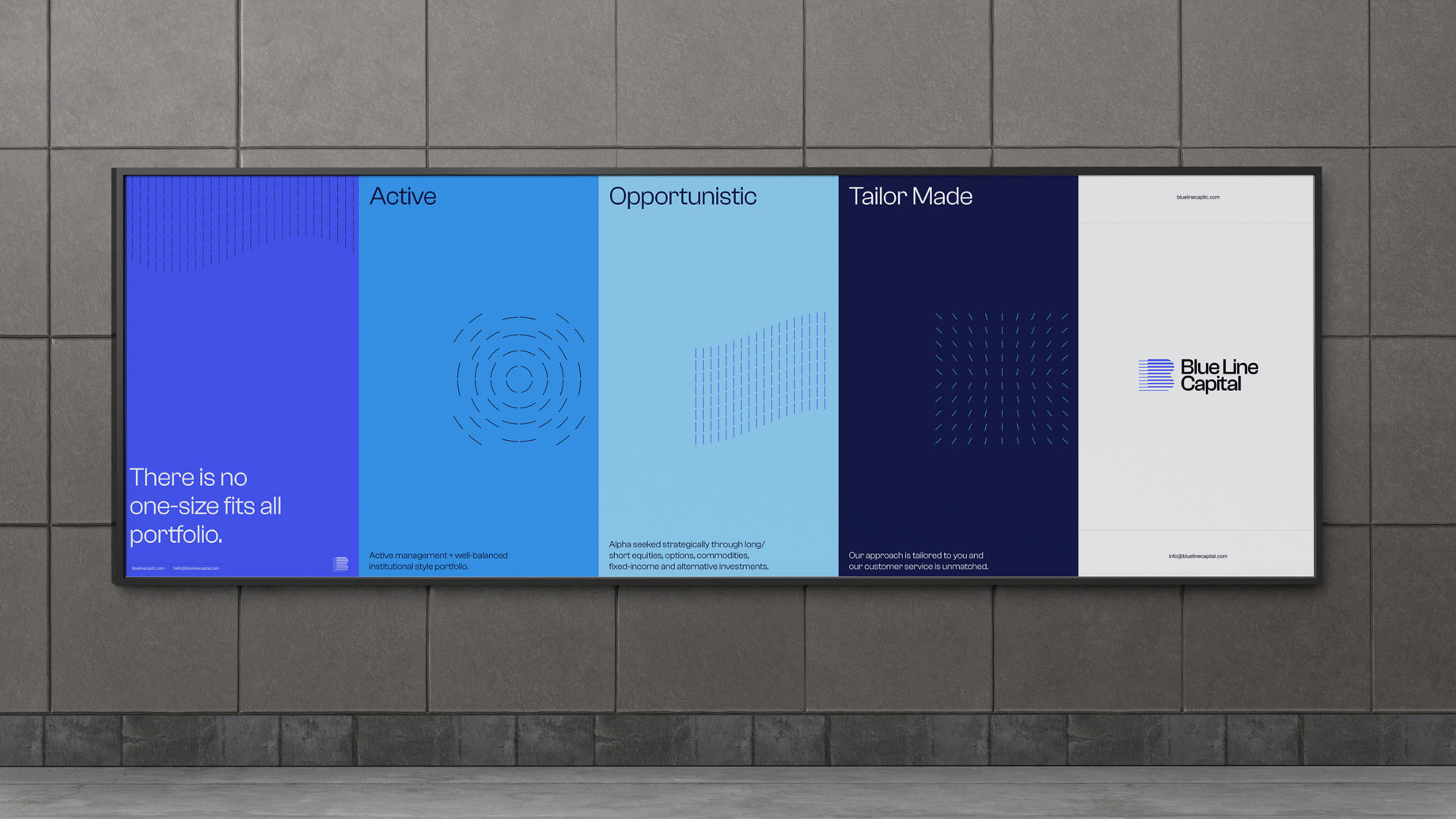
To play on the 'line' motif in the company name to create a stylish new logo and brand, flowing that idea outwards through the CI, investor deck, and new WordPress website.
Branding
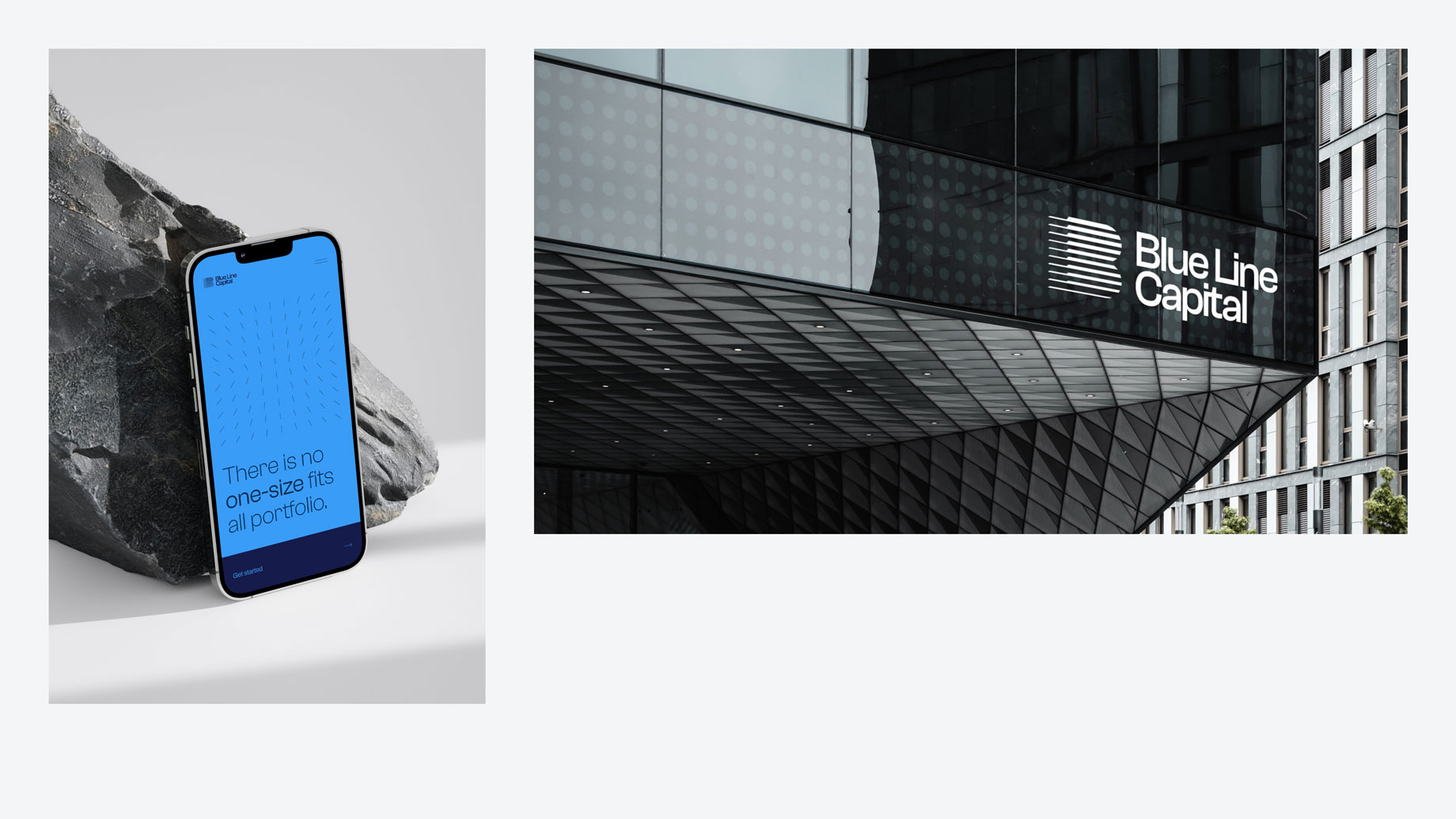
The refresh began with conceptualising a stylish new logo that would reflect Blue Line Capital's sophisticated, high-net worth clientele.
Playing on the ‘Line’ in ‘Blue Line’, we designed a number of options, taking inspiration from the existing logo and online assets and the investment industry (with considerations towards Blue Line Futures). This line motif informed the logo design, brand patterns and design techniques,
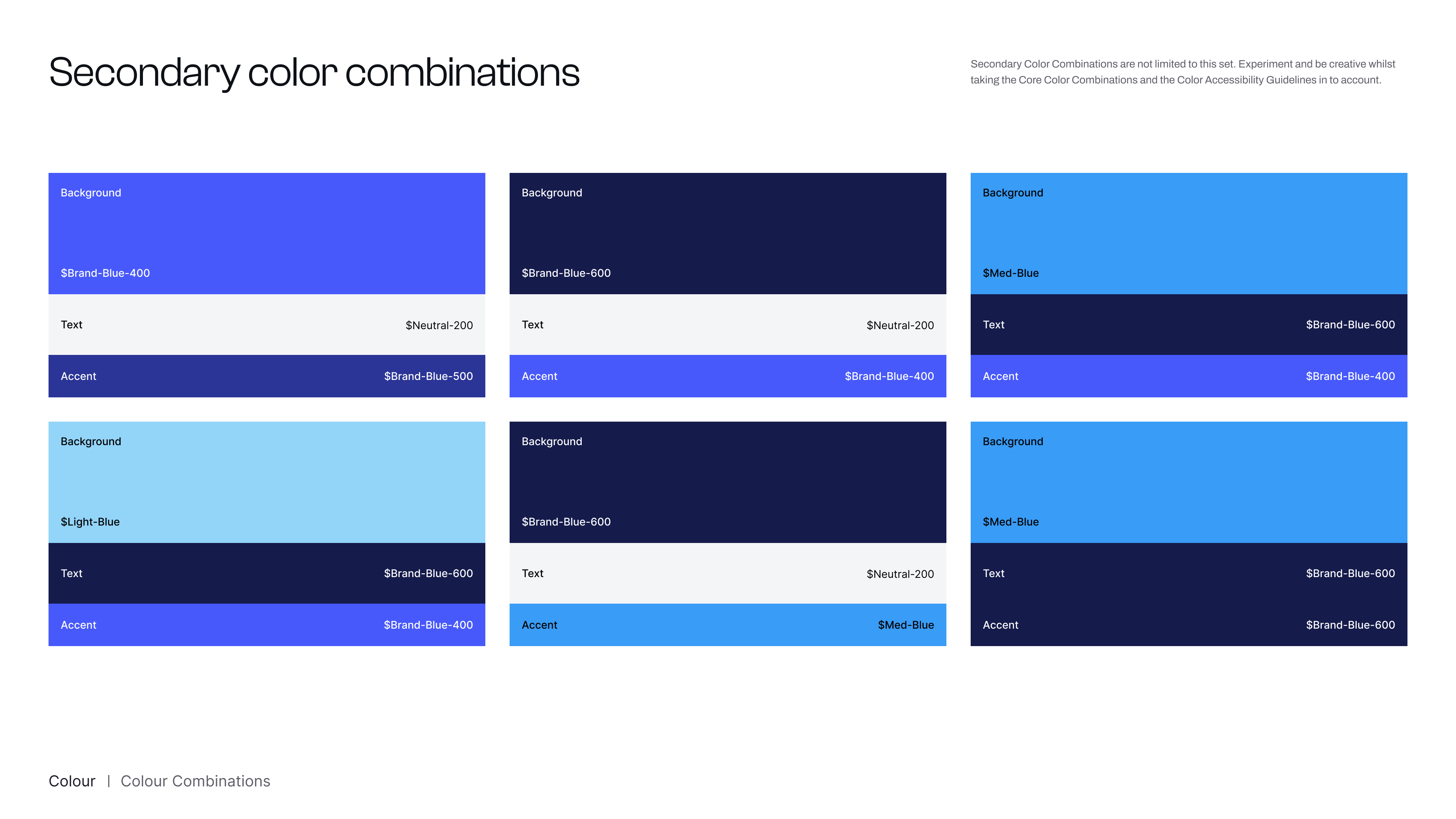
Once client had selected their favourite logo, we set about applying this same thinking to the choice of vibrant colours, modern typography and aspirational imagery.
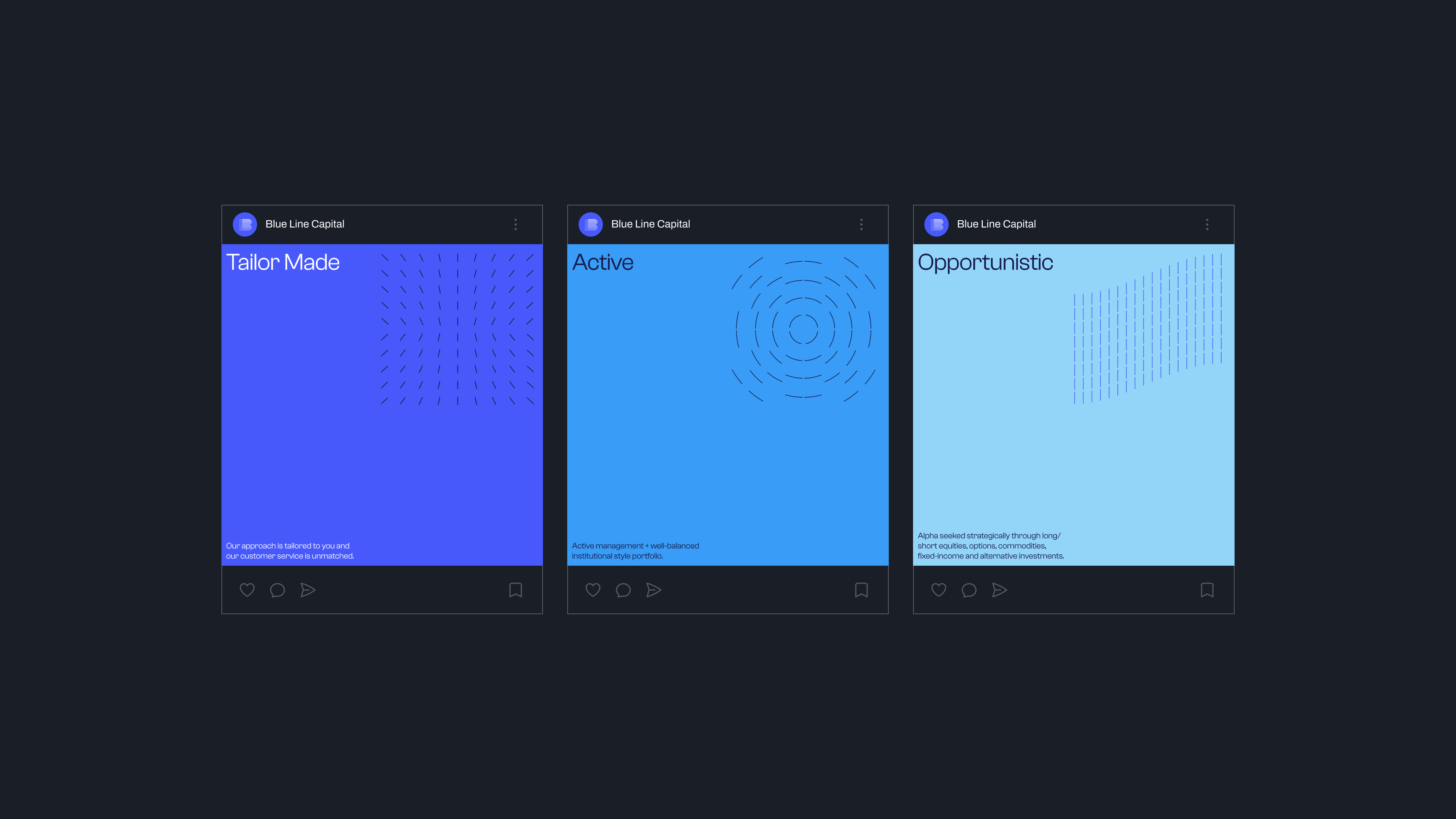
The bespoke illustrations were created to align with, enhance and further the message of Blue Line Capital's USP: 'active', 'opportunistic' and 'tailor-made'.
Each illustration visually communicates each of these qualities and provides a visual layer to compound their meaning.
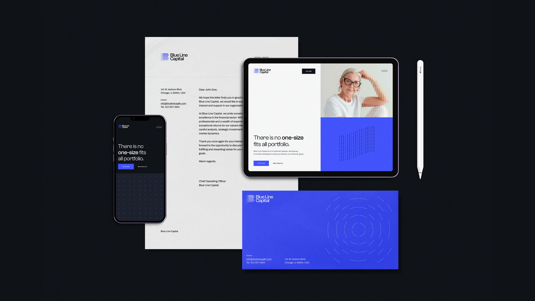
These expressions of the Blue Line Capital brand can be used in both digital and print.




The Website Build
We built the website in WordPress using Elementor to facilitate a speedy turnaround and an easy-to-use CMS for the client's admin team to publish 'insights' going forward. The site is optimised for SEO, fully responsive, and works seamlessly on all devices.
Movement and Animation
Animated illustrations
Bespoke animated illustrations were used as a visual expression of the brand's ethos of dynamism, technical savvy and looking towards the future.
Entrance animation
Moving elements keep the site 'alive' and enhance the brand's ethos of forward motion.
Slide-out menu
A slick, slide-out menu brings an 'edge' to the site, and plays with navigation conventions without breaking the best practice rules of UI design.
Timeline carousel
An animated timeline showcases Bill Baruch's journey from market strategist, to CNBC regular, to Founder and COO.
