Lanseria Airport
International Web & Mobi Site
One website, two user-types.
Whether you're a passenger or a commercial service, airline or pilot,
find the info you need as soon as you land.
Brief
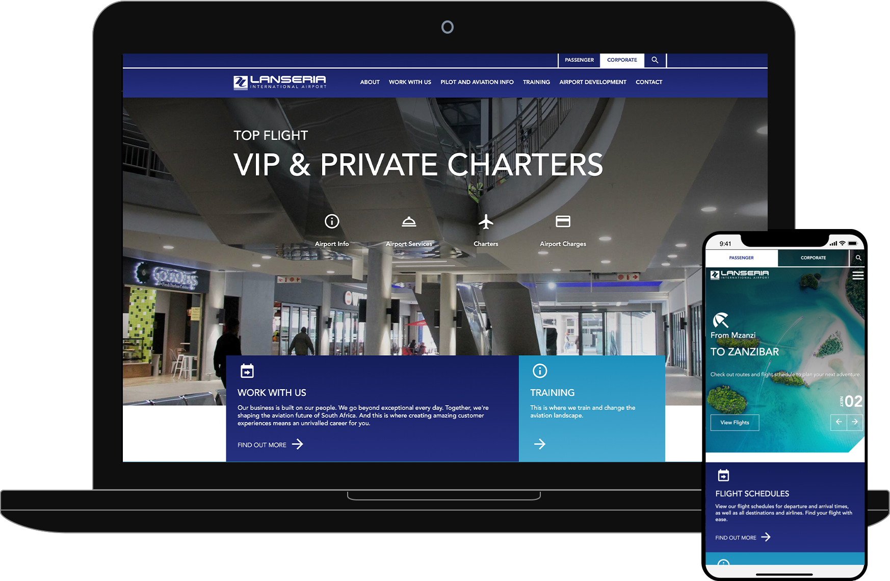
Lanseria needed a web solution that would align with their newly refurbished international airport, and cater to both passenger and commercial services consumers.
The site needed to be easy to navigate, with a fresh new look to reflect their recent cutting-edge airport upgrades. It would require a content management system to allow for easy updates, as well as be scalable and modular in order to integrate with 3rd party services such as flight schedules, traffic, book-a-flight, parking rate calculators and car rentals.
OUR SOLUTION
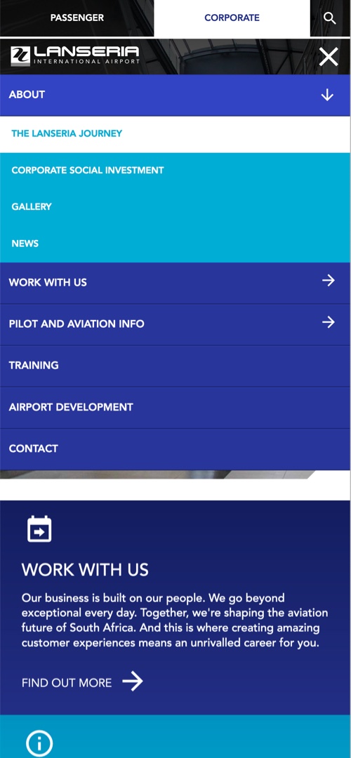
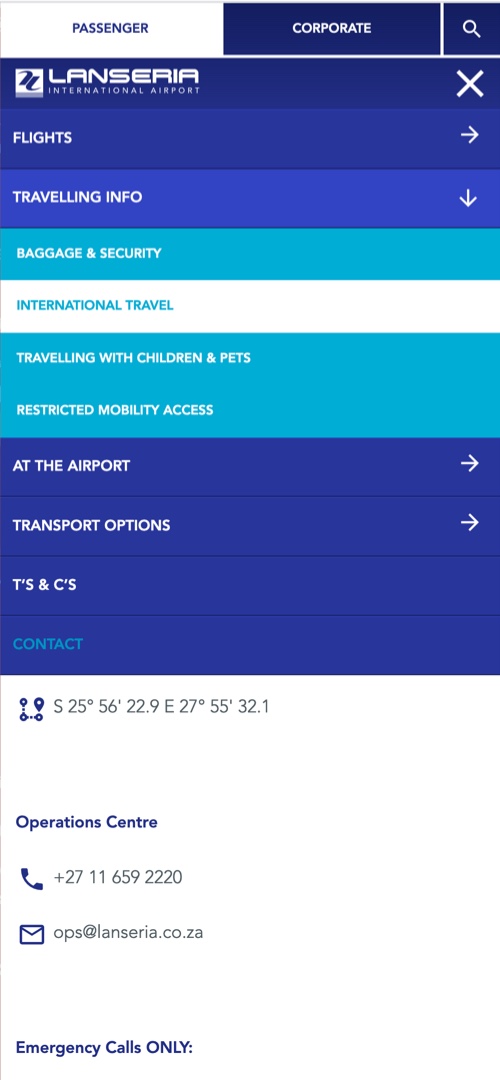
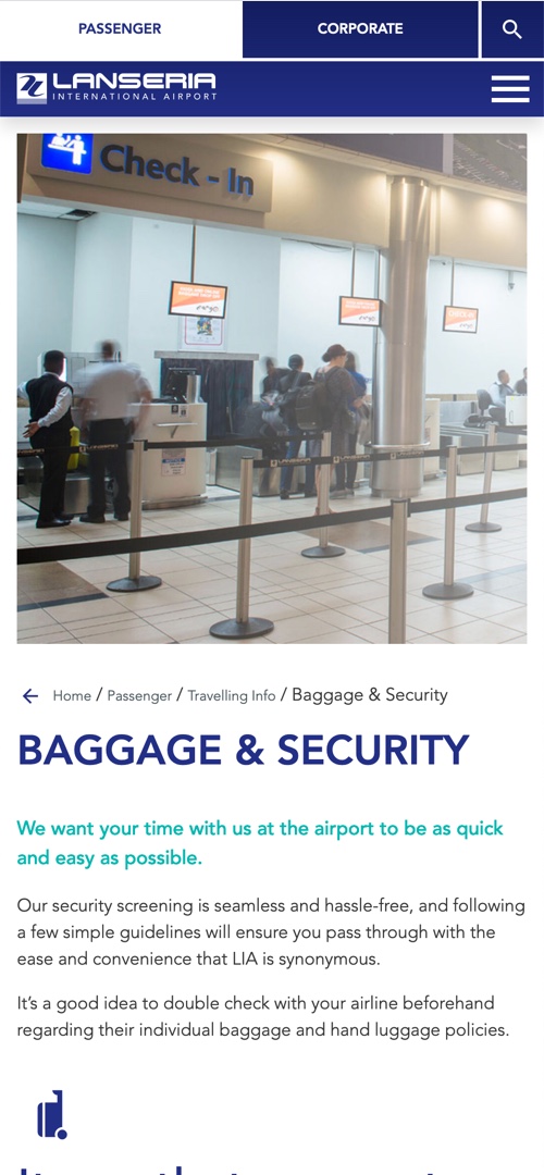
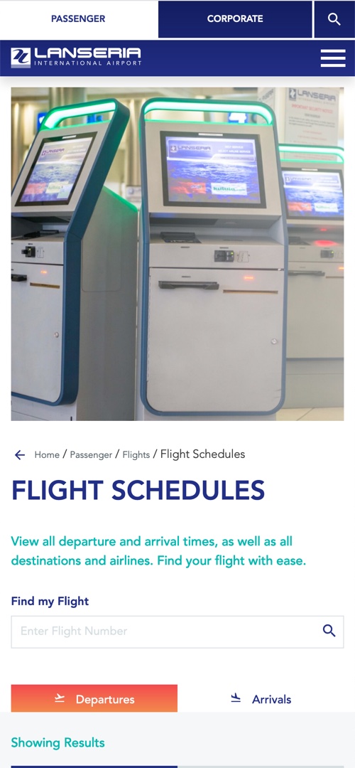
A two-in-one website that's easy to navigate for each user type
The old Lanseria site was difficult to navigate, and there was no definition between user-types.
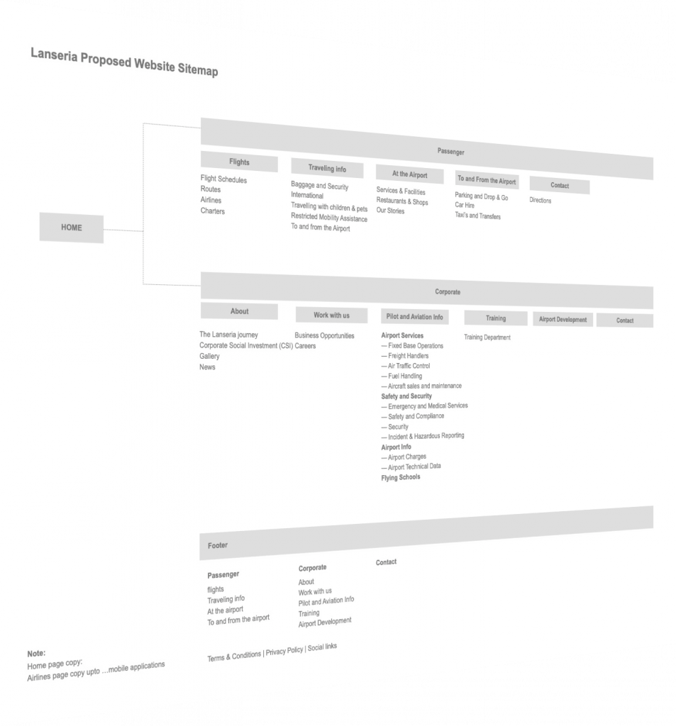
Brave's solution was to build for both passengers and commercial services right from the get-go, splitting up the site map, and working out the user-flow for each type before beginning design.
Built using our own heavily customised WordPress WebStack, the 'get-up-and-go' website is scalable for future feature additions and takes users where they need to go as soon as they arrive.
UX, User Journeys & Wireframes
Defining the User Experience and the consequent user interface for both user types was critical for the future success of this website.
A thorough review of the existing sitemap was needed before we could split the content for the optimal experience of both passengers and corporates. By creating a clickable wireframe we could test the user journeys to refine them before beginning design.


Designing for Today & Tomorrow
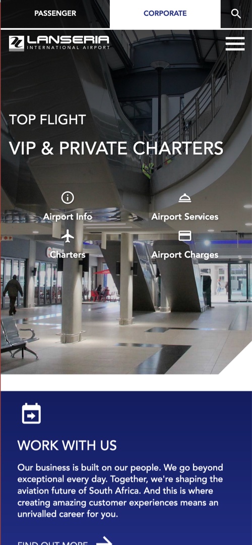
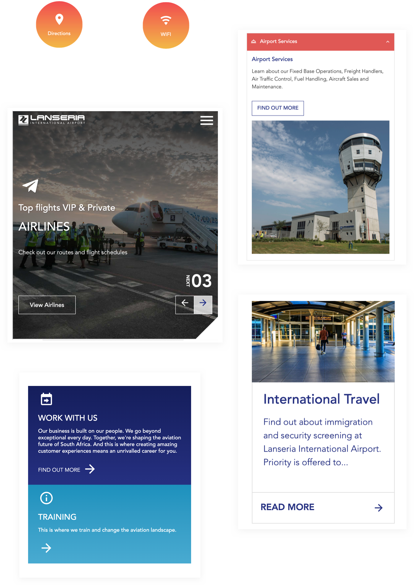
Refreshed as well as refreshing design was a much-needed component of this project, and the design team created a new look for Lanseria's online presence to support the modernised airport facility.
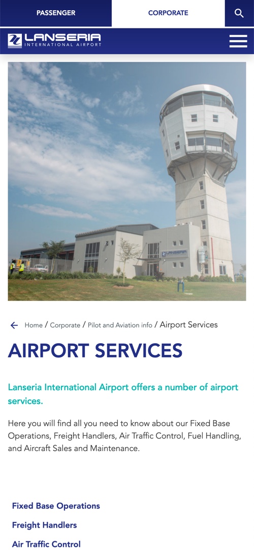
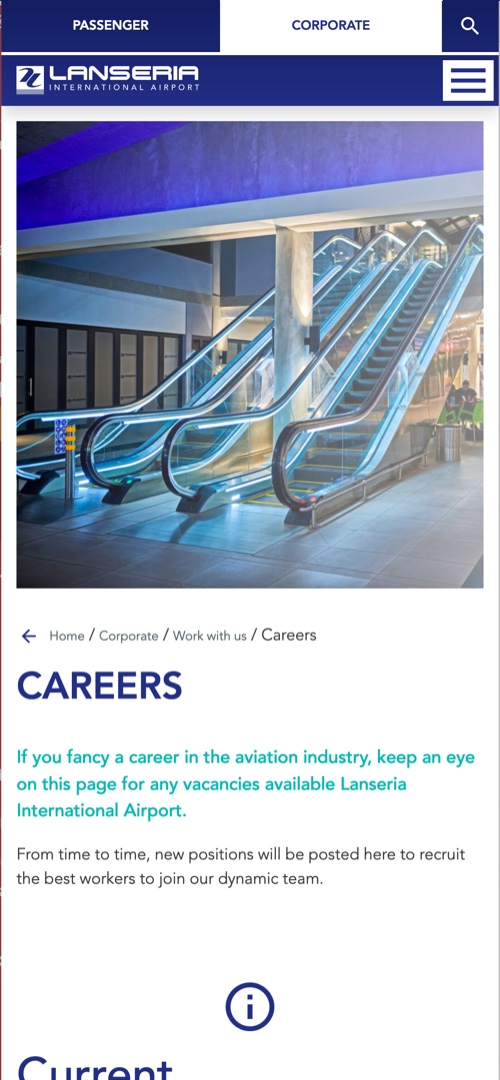
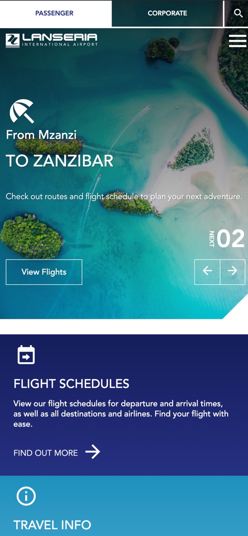
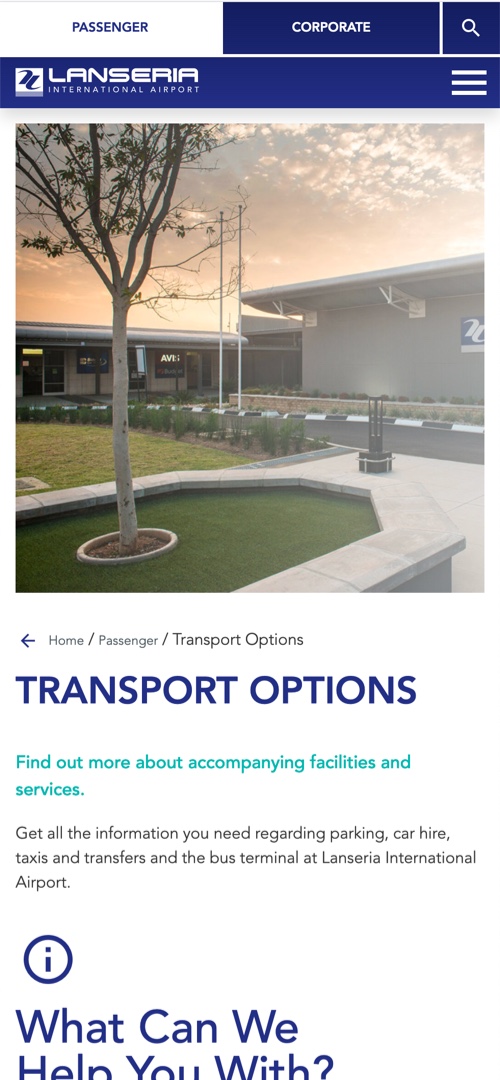
The site was given a lively, enticing look with the clever use of icons in 'Lanseria blue', together with photographic shots of the airport, complimented with a minimal sprinkling of sunset/sunrise shading.
Passenger VS Corporate
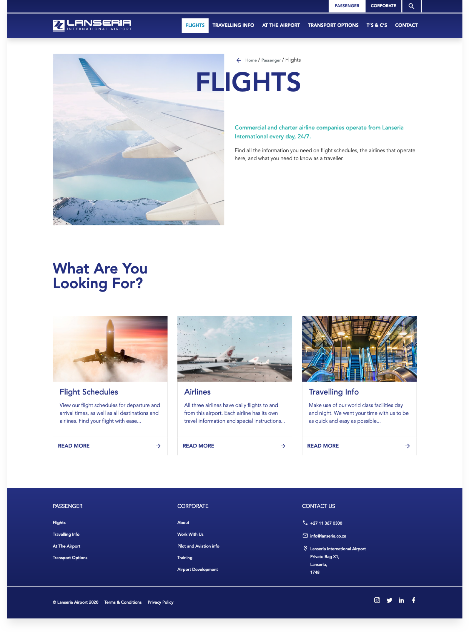
Depending on their reasons for visiting the Lanseria website, users are either going to be embarking on a 'passenger' or a 'corporate' journey. Once they select a chosen path, all content, menus and info will be tailored to their needs, with options to see 'the other side' at any time.
Features
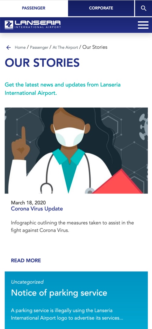
Responsive for mobi
Updated flight schedules pulled in from Excel
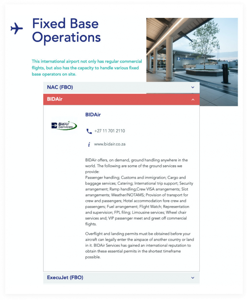
Modal lightboxes to show information of 3rd party companies such as airlines, shops, restaurants and charters
Interactive animated timeline showing history of the airport
User-friendly CMS for easy content updates
Integrated contact forms
Optimised for SEO
How can we innovate with you?
Let us help you improve your online presence and ensure your website works for you.
Get in touch with us now
