Interface
Brand Overhaul & New Website for International Security Powerhouse
Brief
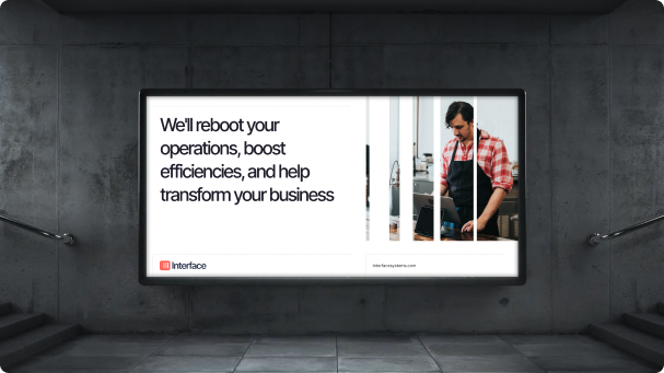
Interface, a leading US company specialising in business security, user insights and purpose-built networks, tasked Brave to completely redesign and refresh their brand, both online and off.
The Brave team were thrilled to work closely with such an established power-house to action an end-to-end update of their visual image.
Not only did we need to redesign their brand and CI from scratch, but we also needed to apply this new look to their huge, multi-page website. A total rebuild was needed, but it was vital to ensure that none of Interface's long established SEO, social legacy and online presence that had been built up over decades, was lost.
BRAVE'S SOLUTION
Modern colour palette, vibrant design, and an animated WordPress website with custom-built features
Branding
We kicked-off the branding exercise by working closely with client to ensure we understood their business model, current business and branding pain-points, goals and vision for the company. We did a deep dive into who Interface are, what they do and what they want to do in the future.
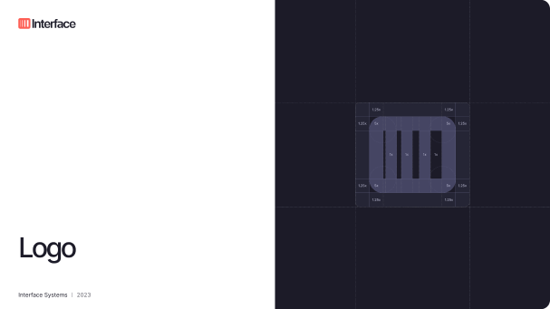
Armed with these insights, we then undertook a full redesign of the Interface logo, which we rebuilt from the ground up with a unique Logotype and Logomark.
We overhauled their colour and typography systems, and tied these in to their service offerings and extended services.
Custom icons were created to relate directly to their main service offerings and target markets.
This process was finalised with a complete brand guideline to service both their online and offline presence, including their extended services such as OneView Edge.
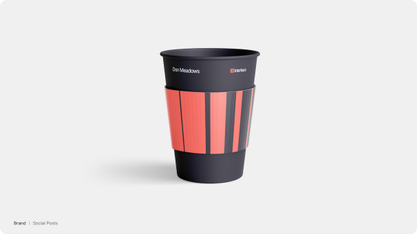
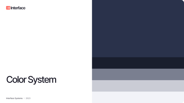
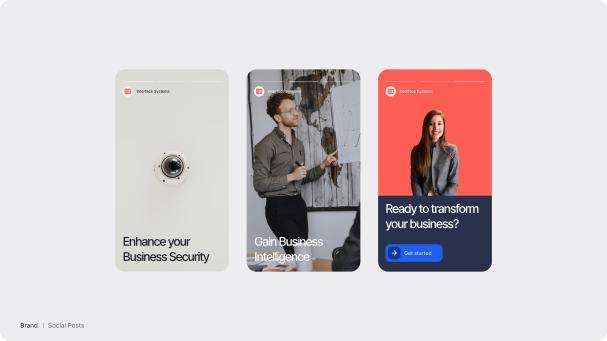
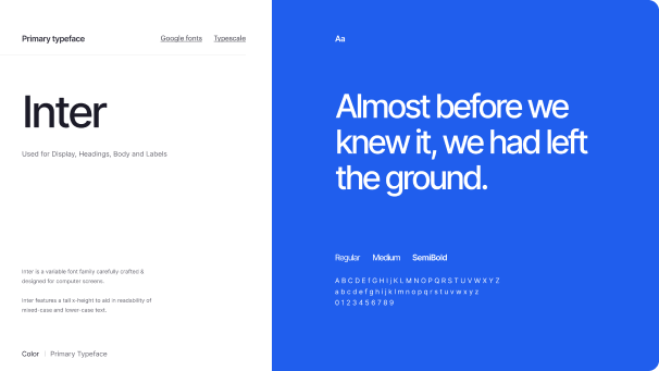
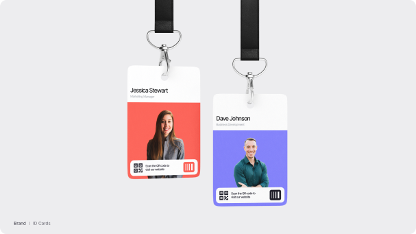
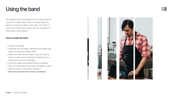
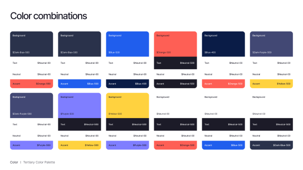
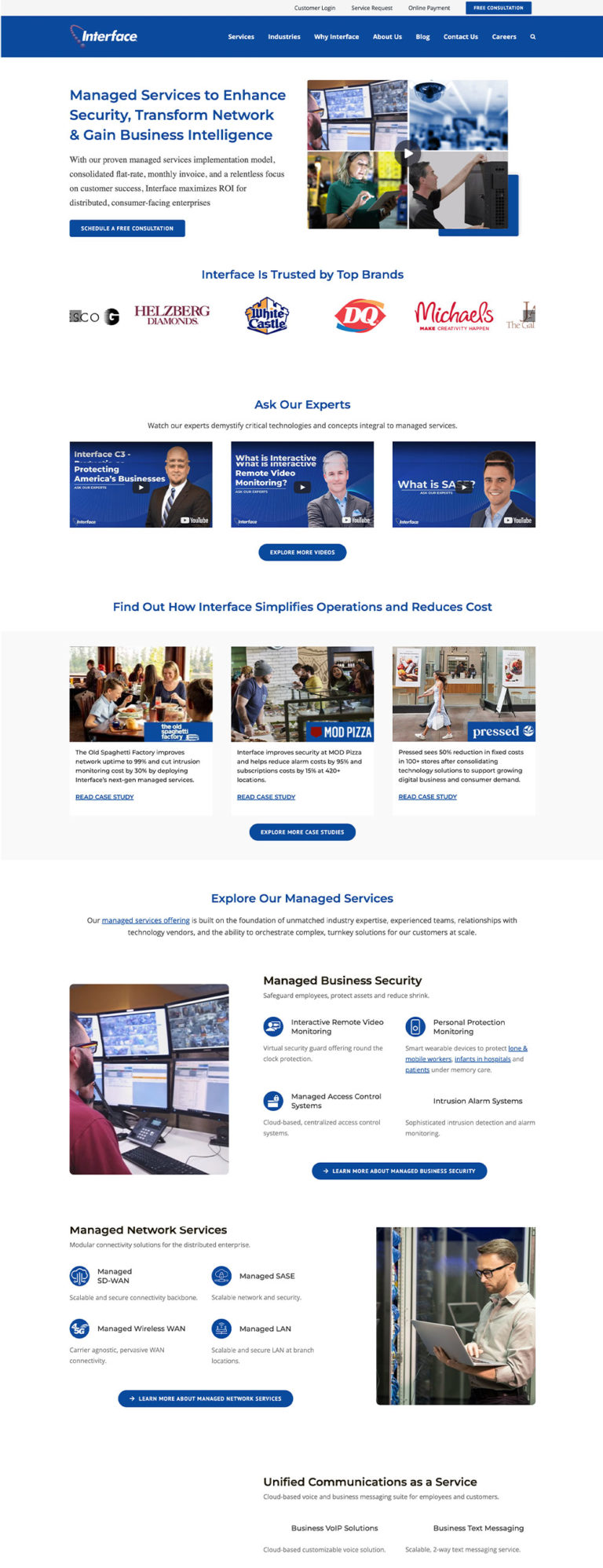
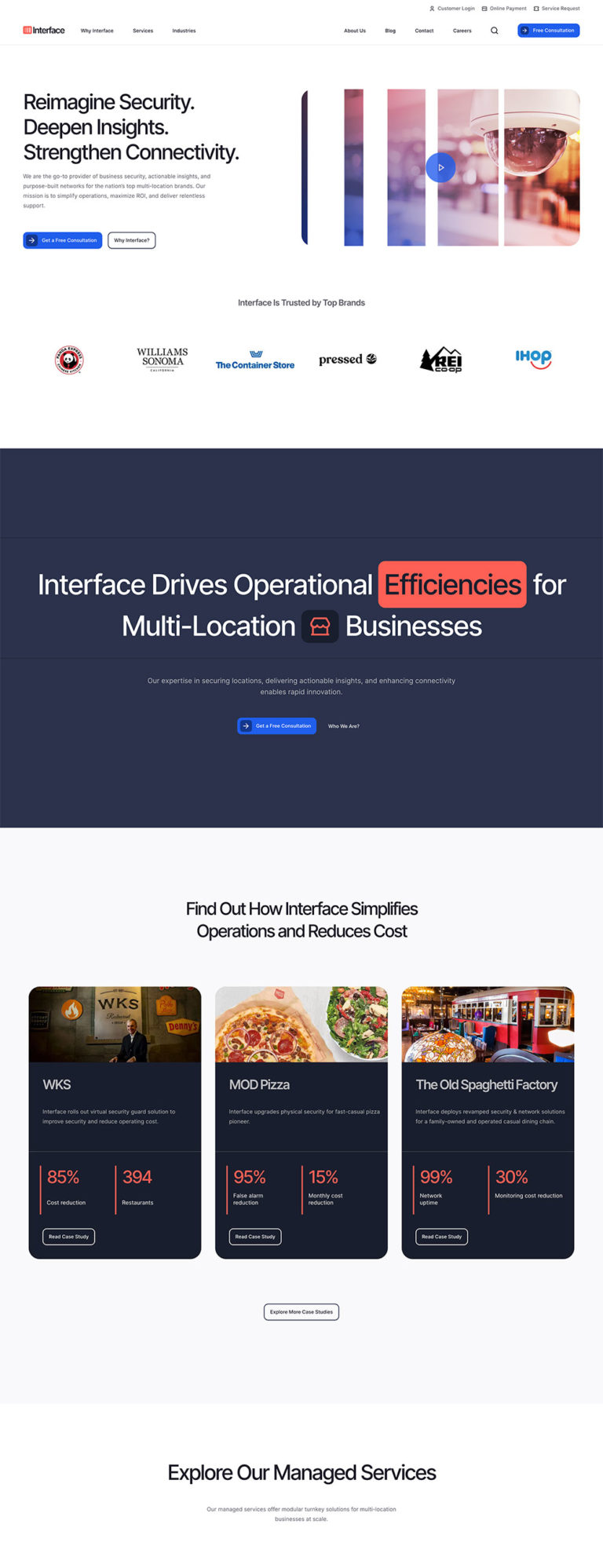
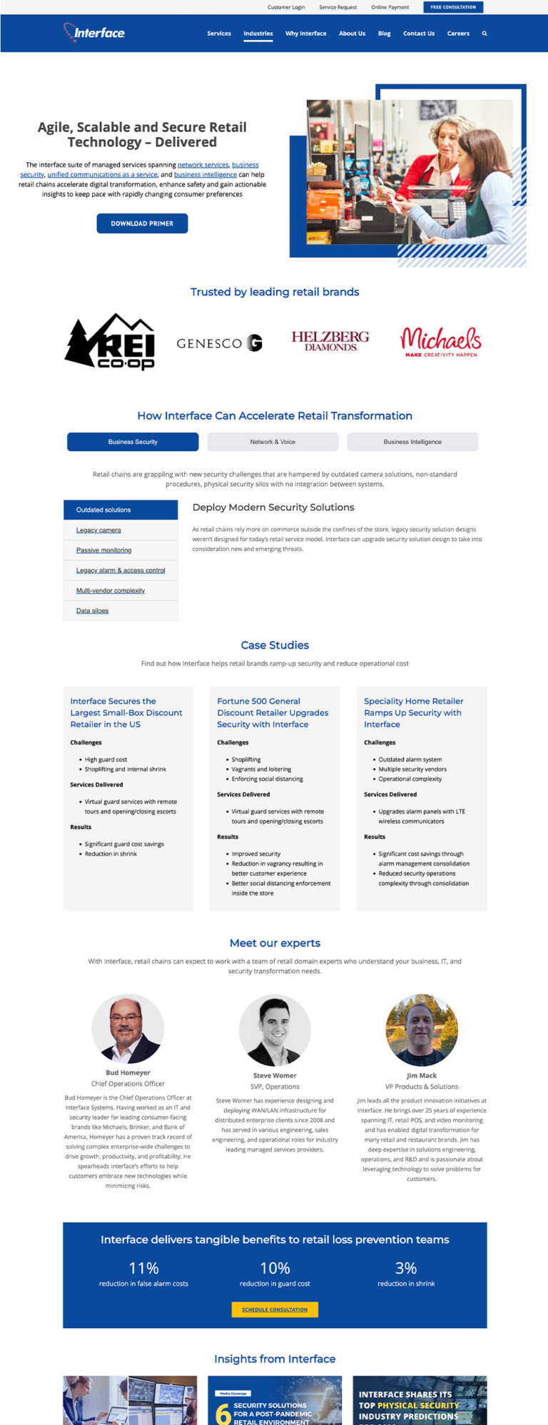
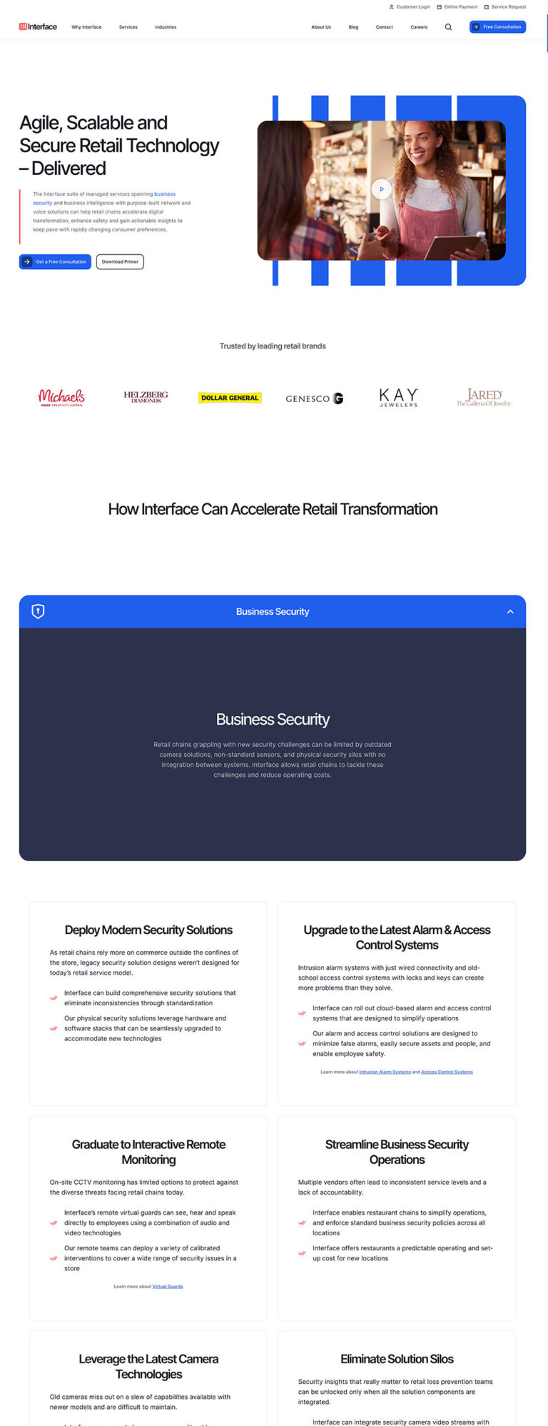
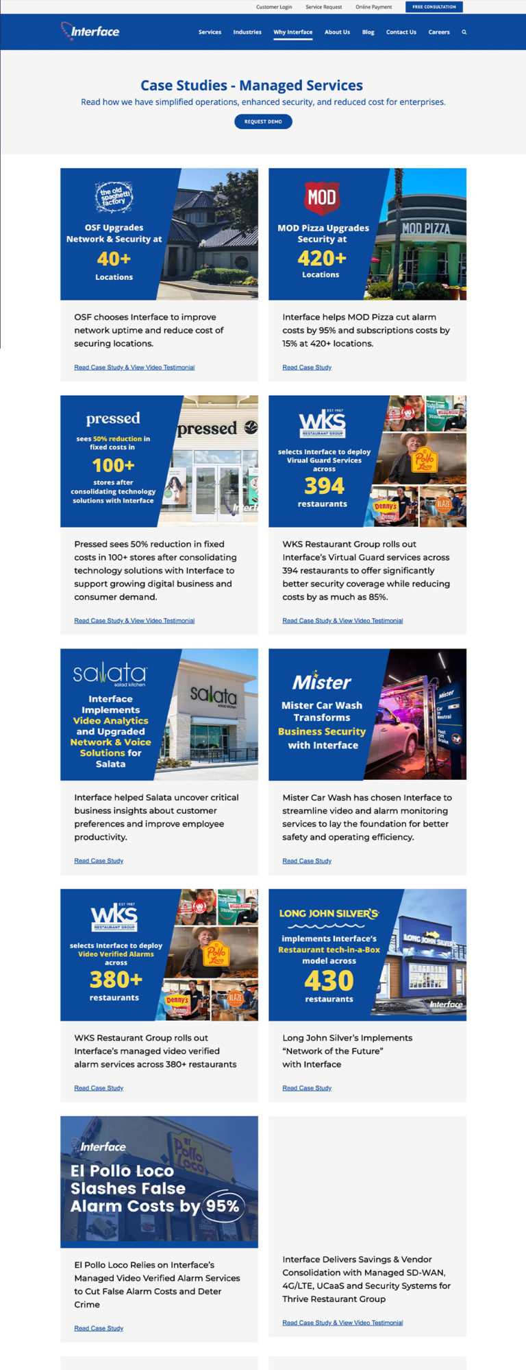
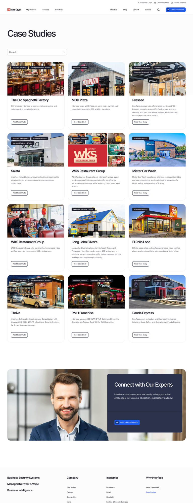
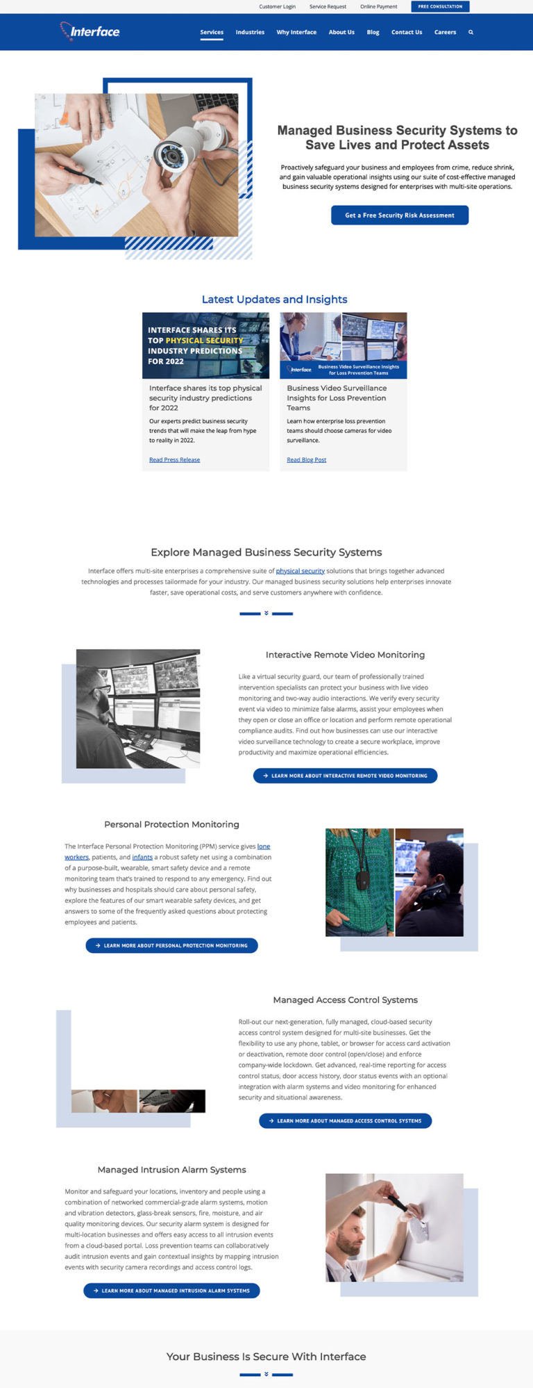
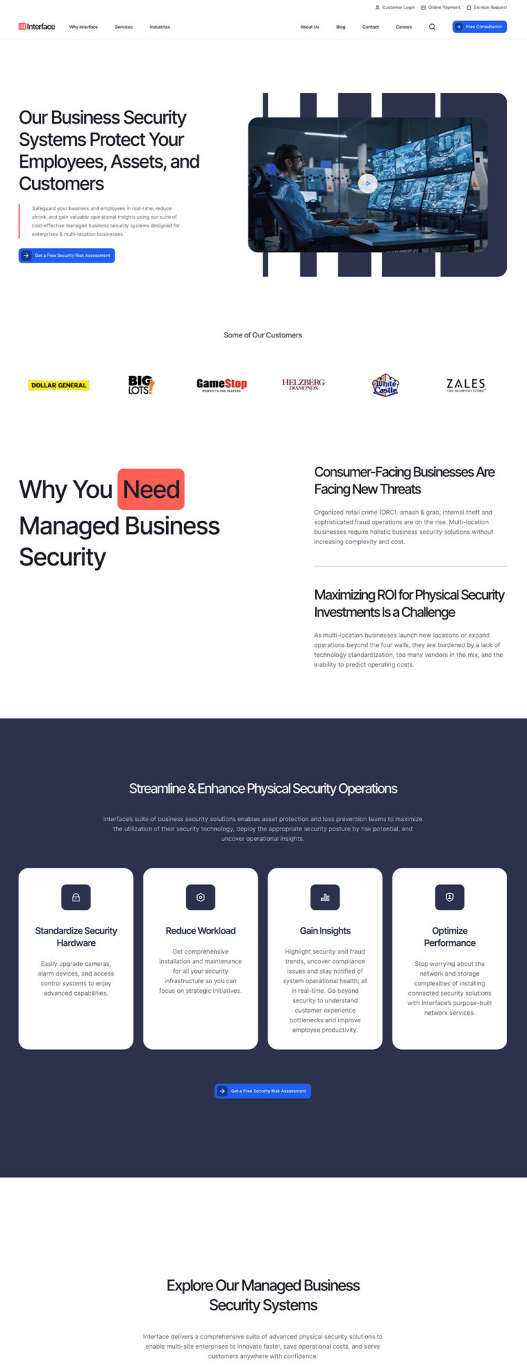
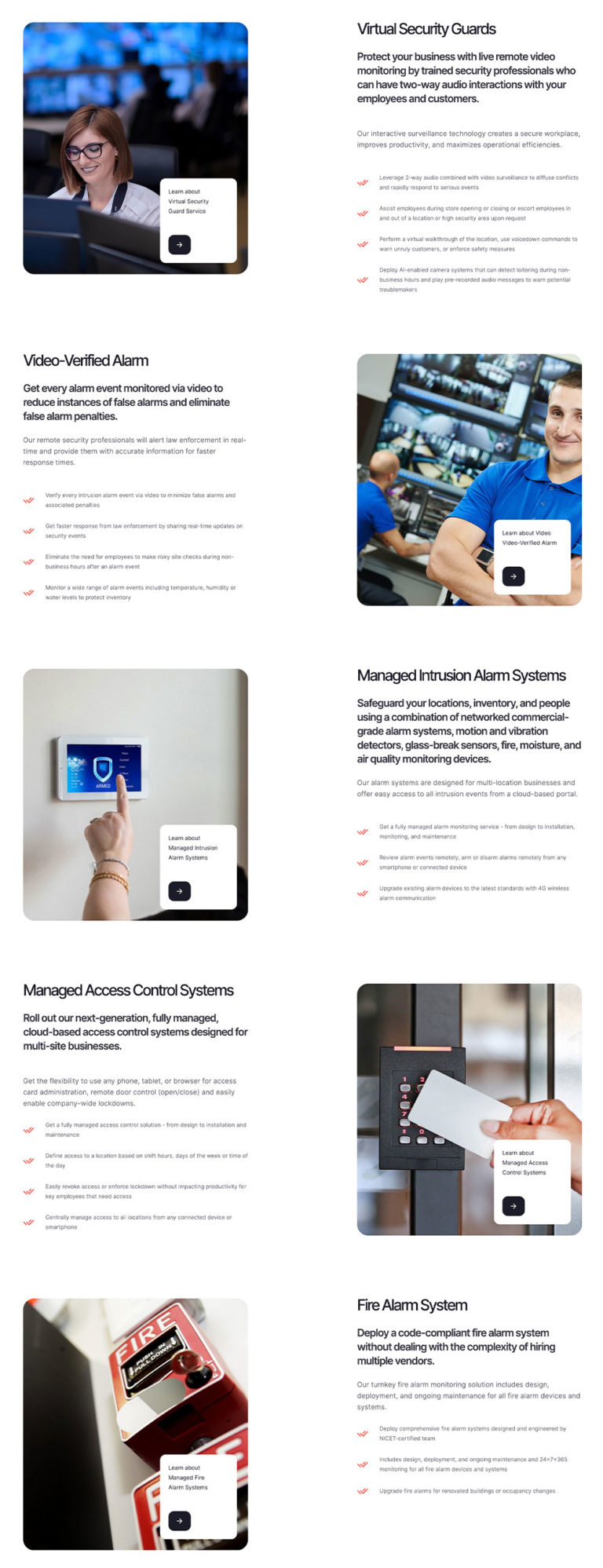
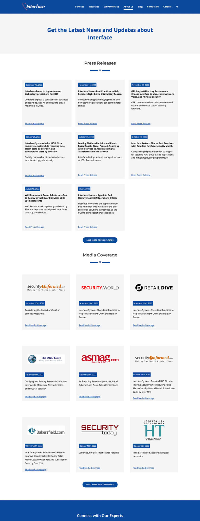
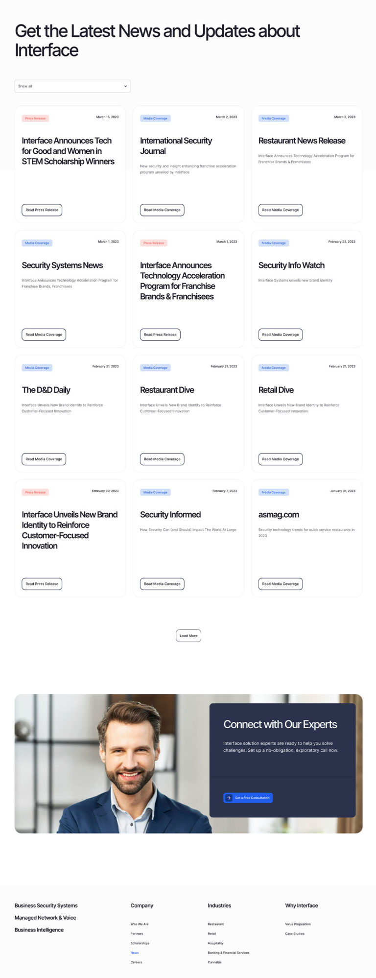
Website Redesign - Old VS New
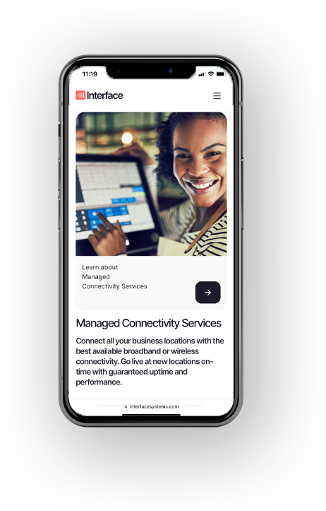
Applying the shiny new branding to the website content was no small challenge considering this site was well over 130 pages in size (including blog posts and case studies), and there was little consistency of format from one page to the next.
After reworking the Information Architecture to slim down and refine the user flow experience where possible, our designer was able to focus on top level pages, and use the design of these to lay the foundation for the sub-pages in various sections.
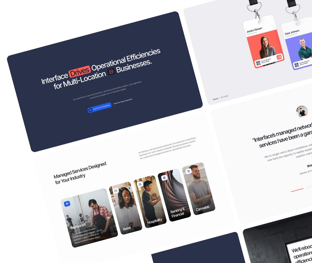
Working within the constraints of the client's specifications with regards to what colours could be applied to which elements, the content was carefully restructured where applicable, and the pages beautifully redesigned to align with the new branding and image treatments.
Highlights of the design featured a unique, user-friendly, visual-focused menu that made the large site easy to navigate and understand at a glance.
Scroll through the images below for a side-by-side comparison between the old version and the new.
Custom Elementor Widgets
Whilst WordPress Elementor is a powerful building platform with a myriad widget options available, the design required that we custom-build a number of 'Interface website specific' widgets that would display the unique design in an elegant way on all user devices.
Bespoke Mega Menu
The interactive menu features encapsulated drop-downs and sub drop-downs, icons where applicable, and clean, bright styling.
Interface Expander
Designed as a stylish, interactive echo of the new logo, the expander widens and narrows each element on hover, allowing users to preview the various industries, and then click for more.
Brave Buttons
We developed a custom 'button builder' widget that allows the content manager to choose from a list of multiple different button styles with icon animations on hover with a simple click.
Seamless Switchover
It was vital to the Interface team that none of their legacy search and social value would be lost after such a comprehensive rebuilding and restructuring of their website.
To ensure that this wouldn't happen when the site was switched over, Brave put systems in place from the very start of development to capture all of the meta information and social share assets from every page and pull them into the new backend, assigning them to their new pages.
We also planned and executed a comprehensive redirection process to ensure that searching and engaging with the Interface website would be seamless for the user, from one day to the next.
Because the original Interface website had such a large amount of content that needed to be ported over, such as multiple FAQs, Media links and Press Releases (along-with their meta information), our developers built bespoke tools to extract and reuse all of this information on the new site, so nothing was lost.
