Visiting a website is kind of like going on a journey…
Sure, it’s a small one, and there’s no need to buy tickets or fill the car up with gas, but anyone who’s hunting for information online becomes a traveller of sorts (one who’s free to embark without washing their face, or even putting on pants).
If you plan a website with this in mind, you become a bit like a trip coordinator or travel guide.
You want to lead the user on a comfortable route through the lovely scenery, learning about the local customs as they go. You want to allow them to stop off and stretch their legs, and with a bit of luck, pick up a few curios to take home.

You don’t want them wandering around, baffled, lost, missing the sights, going up dead ends, sweating furiously, and swearing never to return.
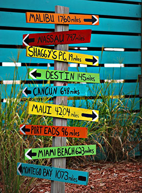 And while you don’t want them to be so bored that their eyes glaze over, you certainly don’t want your user to embark on a ‘hero saga’. Adventure is one thing, but if they have to fight monsters, battle beasts and face down inner demons to find what they’re looking for, perhaps it’s time to tone your content down a notch:
- Limit the colour palette.
- Cut extraneous copy.
- Thin down the links.
- Simplify the navigation menu(s).
- Add clear calls to action.
The current prevalence of long-form, scroll-down pages makes planning the journey a bit easier… as long as the user keeps on scrolling, they’ll see what you want them to see in the order that you want them to see it.
The problem with tourists, however, is they tend to wander off. Leave them alone for a moment and they’ve ambled off the page because something has caught their eye.
No matter how much you obsess about the ‘user journey’, you can’t control what a user is actually going to do when they arrive at your site.
However, if you…
 keep your copy relevant and your styling clean,
- limit the number of links and options for folks to click on,
- and place signposts along the way…
…you can help ensure that the user gets what they came for.
P.S. If you’re planning any of these with your websites, please take The Oatmeal’s advice.
